I’m dabbling with Vue version 3. Here’s Part 1 of 2 in generating a reusable component.
Introduction
Let’s build this. A simple Vue app which demonstrates a reusable notification by way of Bootstrap 4 alerts.
What’s the Goal?
Create a reusable component that displays different types of notifications.
What will we need?
- Stackblitz – to quickly prototype a Vue project and its dependencies.
- Bootstrap 4 – to grab some ready-made user interfaces (e.g. alerts).
Step By Step
Step 1: Create Vue App
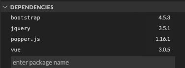
Step 2: Install Dependencies
Step 3: Add Dependencies to main.js
const { createApp } = require("vue");
import App from "./App.vue";
import "bootstrap"; // Add this import.
import "bootstrap/dist/css/bootstrap.css"; // Add this import.

createApp(App).mount("#app");
Step 4: Modify HelloWorld.vue Component
Out of box, Stackblitz generates a default Vue project paired with a component called HelloWorld.vue.
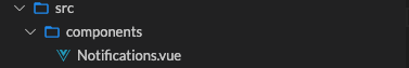
Notifications.vue.The Component Code
Debrief of the Notifications component code:
- Line 2: class binding is assigned passing in a type object.
- Line 3: apply a slot so HTML can be used in full.
- Lines 13-15: the prop defined to pass in what type of alert to display.
Debrief of the App component code:
- Lines 12-14: type attribute will pass in the specific bootstrap class to style the alert.
- Line 13: the HTML from here will be inserted to the slot assigned in the Notifications component.
Key Takeaways
We’ve now created a reusable component which is dynamic enough to apply Bootstrap’s variety of alerts as well as the ability to pass in a message with full HTML by way of slots.
Additional Resources
- Vue School’s free component course.
- Source code for this demo is available on Github and Stackblitz.