Category Archives: Project Log

My collection of web development projects.

Vue Components: Bootstrap Card, Github API

I’m dabbling with Vue version 3. Here’s Part 2 of 2 in generating a reusable component. This time with an API call attached.


Introduction

Let’s build this. A simple Vue app which accesses Github’s REST API and prints a user’s profile into a Bootstrap 4 card interface.

What’s the Goal?

Create a reusable component that displays a person’s Github profile.

What will we need?

  • Stackblitz – to quickly prototype a Vue project and its dependencies.
  • Bootstrap 4 – to grab some ready-made user interfaces (e.g. cards).
  • Axios – the promise based library we’ll use to communicate with Github’s API.
  • Github API – the data source we’ll need to access and display a user’s profile.

Step By Step

Step 1: Create Vue App

Visit Stackblitz.com and click the Vue icon to automatically generate a default HelloWorld project.

Step 2: Install Dependencies

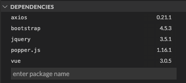
Enter additional dependencies such as axios and bootstrap (jquery and popper is optional but I added it anyway).

Step 3: Add Dependencies to main.js

const { createApp } = require("vue");
import App from "./App.vue";
import "bootstrap"; // Add this import.
import "bootstrap/dist/css/bootstrap.css"; // Add this import.

createApp(App).mount("#app");

Step 4: Create a Service for API Call

Create a new directory called services and add new file GithubAPI.js.

The Service Code

Debrief of the GithubAPI service code:

  • Line 1: Import axios library for promise based HTTP requests.
  • Line 5: Write a function called getGithubProfile() and pass in username as an argument.
  • Line 7: Leverage the get method and concatenate the username variable.
  • Line 9: Return the response object (component will consume this).

Step 5: Modify HelloWorld.vue Component

Out of box, Stackblitz generates a default Vue project paired with a component called HelloWorld.vue. Rename it.

We’ll repurpose most of this by first renaming it to GithubProfile.vue.

The Component Code

Debrief of the GithubProfile component code:

  • Lines 3-16: The Bootstrap card.
  • Line 20: Import the service made from Step 4.
  • Lines 23-28: The prop you’ll pass in (e.g. a profile name).
  • Lines 29-33: Setup Vue’s data object which will populate the card.
  • Lines 34-42: Setup the API call inside of the created lifecycle hook.

Debrief of the App component code:

  • Line 13: the prop passed in as a string (e.g. my profile name).

Key Takeaways

We’ve now created a reusable component which is dynamic enough to apply a Bootstrap card by passing in the Github profile as a prop. This will use Github’s API to make a call on their end which will print the profile data to the card.

Additional Resources

Vue Components: Bootstrap Alerts

I’m dabbling with Vue version 3. Here’s Part 1 of 2 in generating a reusable component.


Introduction

Let’s build this. A simple Vue app which demonstrates a reusable notification by way of Bootstrap 4 alerts.

What’s the Goal?

Create a reusable component that displays different types of notifications.

What will we need?

  • Stackblitz – to quickly prototype a Vue project and its dependencies.
  • Bootstrap 4 – to grab some ready-made user interfaces (e.g. alerts).

Step By Step

Step 1: Create Vue App

Step 2: Install Dependencies

Enter additional dependencies such as bootstrap (jquery and popper is optional but I added it anyway).

Step 3: Add Dependencies to main.js

const { createApp } = require("vue");
import App from "./App.vue";
import "bootstrap"; // Add this import.
import "bootstrap/dist/css/bootstrap.css"; // Add this import.

createApp(App).mount("#app");

Step 4: Modify HelloWorld.vue Component

Out of box, Stackblitz generates a default Vue project paired with a component called HelloWorld.vue.

We’ll repurpose most of this by first renaming it to Notifications.vue.

The Component Code

Debrief of the Notifications component code:

  • Line 2: class binding is assigned passing in a type object.
  • Line 3: apply a slot so HTML can be used in full.
  • Lines 13-15: the prop defined to pass in what type of alert to display.

Debrief of the App component code:

  • Lines 12-14: type attribute will pass in the specific bootstrap class to style the alert.
  • Line 13: the HTML from here will be inserted to the slot assigned in the Notifications component.

Key Takeaways

We’ve now created a reusable component which is dynamic enough to apply Bootstrap’s variety of alerts as well as the ability to pass in a message with full HTML by way of slots.

Additional Resources

Add FAQ to Shopify Collection in 5 Steps

Introduction

An FAQ interface is a straightforward way to provide your customers with the insight they need without the need to call customer service. In this tutorial, I will show you how you can take an existing collection template (irrespective of theme) and add an editable interface by way of sections in 5 easy steps.

This specific case leverages Bootstrap 3 Accordion techniques (as the theme was built with it), however all of this can be integrated via Bootstrap 4, other JavaScript toggling solutions and CSS only implementations.

My 5 step tutorial assumes you have basic/intermediate knowledge of Shopify, HTML/CSS and that you’re able to read a JSON object (see schema tags).

In The Trenches

Step 1

First and foremost, you’ll need to embrace Shopify’s opinion on how code is organized.

Assuming you have access to your store, jump in to Shopify Admin > Online Store > Themes. From the Actions drop-down menu, click Edit code and you’ll be navigated to the online code editor built into Shopify.

Take stock on how Shopify organizes its codebase. You cannot deviate from this opinion. It is a tight structure and the abstractions are intentional.

Step 2

Navigate to Sections directory, click Add a new section and create this new file: collection-faq.liquid.

Step 3

The code. Here’s the breakdown of that in short order:

  • Line 7, 34: The for loop keys off from schema settings defined from line 44.
  • Line 8, 10, 33: A decision will be made to either print a header or a panel.
  • Line 23, 25, 27: A decision will be made to either display or hide the answer.
  • Lines 40-91: The required schema tag which ultimately defines your UI and its editable fields and initial settings.
  • Line 93, 94: optional custom CSS styling to lay on top of this section.
  • Line 96, 97: optional custom JavaScript to lay on top of this section.

Step 4

Reference this newly created section to on your theme’s collection template: /templates/collection.liquid

{% section 'collection-faq' %}

Frankly, you could add this interface to whatever template you see is most fitting for your use case.

Step 5

Test it! Navigate to Shopify Admin > Online Store > Themes and click Customize.

Inside of the preview panel, click into a collection page which leverages your new addition. From there, you will see your FAQ settings on the left panel and a preview screen on the right.

Once inside of the Customize screen, you have full authority in adding/removing FAQs and previewing that in real-time.

Go ahead and add/remove a header, question and an answer! It won’t save unless you click the Save button at the top-right.

Conclusion

Sections are awesome. It’s a great way to extend an established theme with your customizable interfaces.

If I have one gotcha to reinforce it’s this. Always revisit step 1. Acknowledge Shopify’s file system and don’t dance around it. The way it organizes its assets are very much intentional and if you can quickly accept the Physics of this particular world, you’ll very much learn how do these kinds of tasks in 5 steps or less.

Additional Resources